It’s easy to take starkly geometric styles for granted. They’re something that we spend our foundational years learning the names of, counting the sides of, and using them as reference points to find their fused forms amongst the complex shapes of our world. It’s not surprising, perhaps, that some struggle to see deeper meaning in the likes of geometric abstracts and hard-edge paintings. But the Vancouver Art Gallery has put a strong case forward to the sheer impact of this form with their latest exhibition, Hard-Edge.
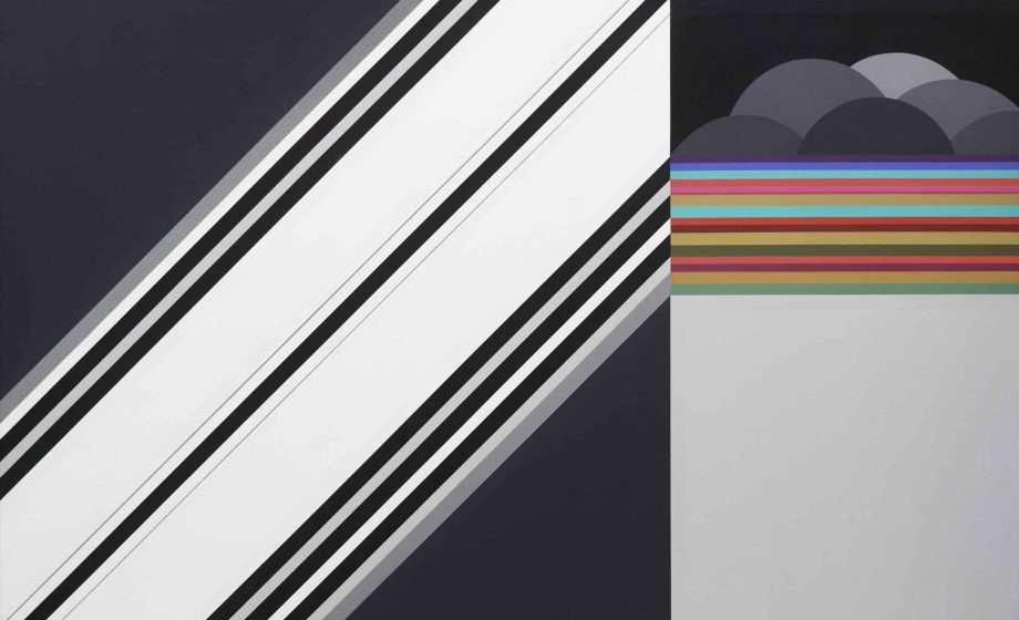
Selected primarily across the 60s and 70s, Hard-Edge is a varied and entrancing look into a style of deceptive simplicity. Characterized by distinct divisions of colour—spaces and shapes consisting usually of one uninterrupted colour—the near-mathematical precision of hard-edge painting has the capacity to powerfully evoke feelings of imposing uniformity as much as they do the spirit of variance. And this dichotomy of energy in the form is on full display in this exhibition.
Curated entirely from the VAG’s collection by Dr. Richard Hill, Smith Jarislowsky Senior Curator of Canadian Art, one is quickly confronted with both sides of hard-edge’s spectrum. Through the likes of Diade Bleu-Vert and Structure Orange-Vert one sees the strength in the variation of a single colour within solid, rectangular confines to evoke weight or energy, and in the wide curvature of and primaries of Quiet Landscape one can sense a buoyancy and expansiveness beyond the confines of the canvas. Douglas Morton’s Fracture Black seems to hold this division within itself and has an irrefutable draw inward for the viewer, deeper than the canvas contains. It’s easy to see the styles relation to colour-field works like those of Rothko through their sheer use of overwhelming bodies of colour.

Quiet Landscape, 1965
oil on canvas
Collection of the Vancouver Art Gallery, Gift of Patricia McCulloch
To speak of the confines of the canvas, Hard-Edge showcases some of the brilliant shapings that artists took to the containers of their works in this field. Optional Module is perhaps the most obvious of them, its physical construction powerfully evoking the divisions represented in the content of these works (and somewhat endearing referred to many a passerby as “a pizza”). Frank Stella is one of the most impactful artists of this technique, exemplified in Darabjerd II; with its curved frames and concentric quarter-circles, each layer radiating with a gentle vibrancy, Stella creates heavenly geometry—cartography of the astral plane. It is impossible not to find yourself lost somewhere in those lines.

While there are aspects of these works on display that immediately evoke their era, some of the pieces on display feel deeply connective to modern sensibilities and recent history in a timeless manner—another testament to the power of this style. The untitled works of Leon Polk Smith, with their clean yet asymmetrically divided circles, feel like a new alphabet of symbology. But Brian Fisher’s Passage is truly striking in evoking what feels like a keystone of early digital art sensibilities. Through its thin, precise lines and deep colours, it connects hard-edge work to early vector works—one through choice and one through necessity—in a way that makes this 1966 painting feel truly anachronistic.

Passage, 1966
Acrylic on canvas
Collection of the Vancouver Art Gallery, Gift of J. Ron Longstaffe
Hard-Edge is an entrancing look into a subset of abstract geometrics that held a rich collective in North America. Exemplifying both uniformity and the rejection of it, dichotomy, division, and dreamlike illusion are found in spades across these works. The VAG has put together an exhibition that opens your eyes to a valuable part of modern art’s history—and when they’re there, you’ll have a hard time taking them away.


